




EDITION→
Global
•
USA
•
UK
•
AUNZ
•
CANADA
•
IRELAND
•
FRANCE
•
GERMANY
•
ASIA
•
EUROPE
•
LATAM
•
MEA
Edition : InternationalLanguage : English
HOME
NEWS
CREATIVE LIBRARY
IMMORTAL AWARDS
MEMBER COMPANIES
PEOPLE
JOBS
How LBB WorksPlans & PricingEditorial Toolkit

news
NEWS
CREATIVE LIBRARY
IMMORTAL AWARDS
MEMBER COMPANIES
PEOPLE
JOBS
Login or Register
People in association withThe Monthly Cut

Storytelling Through Colour with Andrew Kunkle

lbbonline.com
0
LIKE
ADD TO COLLECTION
23/07/2026
Share
The Format post-production supervisor and senior colourist looks back on his proudest work, what healthy collaborations look like, and his advice to those starting their career in colour grading, as part of LBB’s Making The Grade series
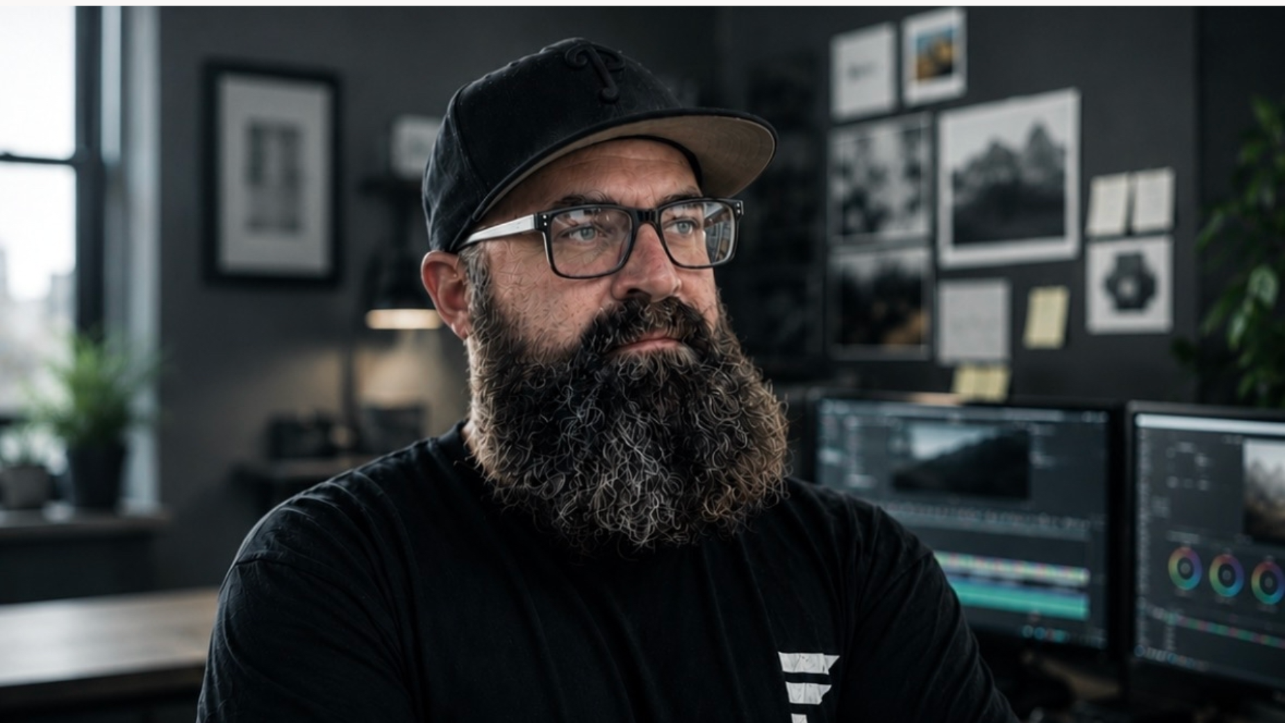
Andrew Kunkle is Format’s post production supervisor and senior colourist, overseeing projects from pre-production planning through final colour, finishing, and delivery. With more than two decades of experience across commercial production and post-production, he serves as a critical link between creative vision and technical execution, ensuring projects move efficiently from concept to completion.
Unlike traditional post-production supervisors who enter the process after production wraps, Andrew is involved from the earliest stages of development. He collaborates with directors, producers, and creative teams during pre-production, advises on technical workflows during production, and leads post-production through editorial, VFX integration, colour grading, finishing, and final delivery.
His recent work includes supervising post-production and colour for Adventure Aquarium’s ’Imagination’ campaign, overseeing complex VFX and finishing workflows for Trane’s ’Nonstop Brilliance’ campaign, supporting CGI-driven projects for Five Below, and managing post-production pipelines for multiple White Castle television campaigns featuring extensive 2D and 3D animation. He has also contributed to campaigns for brands including Nestlé, Gerber, Sparkling Ice, Sheetz, Visit Philadelphia, Comcast, and Amazon.
Known for his calm leadership and solutions-orientated mindset, Andrew excels at building efficient workflows, anticipating challenges, and aligning creative, production, and post teams around a common vision. Whether managing large-scale commercial campaigns or highly technical VFX-driven projects, he ensures every deliverable meets the highest creative and technical standards.
Andrew sat down with LBB to look back on 20 years in the editing suite, the many lessons he learnt on the way.
LBB> What was your first experience with the world of colour grading – and when did you decide that being a colourist was a role that you wanted to pursue?
Andrew> I’ve been editing spots for over 20 years now, and there’s always been some form of colour grading involved, whether balancing shots or fixing footage in whatever programme I was using to edit. But a few years ago, when I began using Da Vinci Resolve to colour grade, things really ramped up. I went from ‘fixing’ footage to sculpting an image and really being able to tell a story just with the grade.
LBB> What was the project that you felt really changed your career?
Andrew> One of the most interesting jobs that really levelled up my career was for White Castle.
The concept was a 1920s flapper party that was shot in a studio that was dressed to look like a 1920s apartment. The tricky part was the environment and the ‘sliders’ needed to be in colour, while all of the people in the commercial needed to be in black and white. The colour grade on this was pretty straightforward, but the VFX and rotoscoping were unlike anything else that I had done before. Pulling this one off helped give me the confidence that anything was possible.
LBB> How/where did you hone your craft, and did you have any particular mentors?
Andrew> Primarily from practice. Watching tutorials online and a few colour grading courses. Darren Mostyen is one colourist that I found particularly helpful.
LBB> Tell us more about your creative process – (e.g., when you get a project, how do you go about developing a look?)
Andrew> When developing a look for a new project, if it’s for a specific product, I usually look at the brand’s website and check out the set brand guides and colour palettes, and go from there.
Generally I’ll balance and correct the footage, then create a look for the spot, whether it’s a more gritty Halloween theme or something more sterile for a medical / pharma client; all plays a part in creating the look.
LBB> From experience, we’ve found that colourists often love art and photography – when you’re out of the studio, what inspires you?
Andrew> There are so many places I find inspiration that influences me, TV shows, films, music videos and commercials, as well as following photographers and other colourists on various social media platforms. I often find myself watching a TV show and getting caught up looking at the colour grade of a particular scene.
LBB> Colour grading is largely a digital affair, but there’s also been a resurgence of film over the past few years in commercials and music videos. What are your thoughts about working on film versus digital formats like 4K? And what are your favourite techniques for capturing a vintage or tactile feel?
Andrew> Working with digital formats that are so crisp and sharp has its advantages and disadvantages. They look ‘technically’ great; they are sharp and offer a lot of flexibility. However, everyone loves to see the nostalgic look of film. Adding grain and halation is always helpful. There are a handful of LUTs that can be useful as well.
LBB> When working in commercials, what role can colour and a grade play in enhancing a brand’s assets, and what sort of conversations do you have with creatives and clients about that (e.g. is there often a strategic/consistent ‘look’ for a brand)? Can these be too heavy-handed?
Andrew> When grading a commercial, it’s important to make the product stand out and look its best. Whether it’s food or a product, it’s got to look appetising or match its real-world look.
Following brand guidelines is also imperative; it helps tie in the commercial to the rest of the marketing across all platforms with a consistent look. We often talk with the creatives on what emotion they want to elicit from the viewer and go from there when making decisions in the grading process.
LBB> How do you ensure that each colourist-director partnership is a success?
Andrew> To ensure each relationship between colourist and director is successful, mutual trust and clear communication must be established. It’s important to review mood boards, stills or other references early on and discuss what the final project should look like. This is a good time to sync up and develop the same ‘visual language.’ That way during the grading process you are able to take a vague note and turn it into an actionable change. (For example: ‘Can this feel more inviting?’ could mean soften contrast, warm up skin tones.)
LBB> What advice would you give to budding colourists?
Andrew> The best advice to give to a budding colourist is to practise and learn. There are plenty of useful tutorials online to learn from, but getting hands-on is always best.
A good exercise is to grade a scene, then start over from scratch, and regrade it using a different set of tools or a different technique to push yourself to think of other ways to solve problems.
LBB> In your opinion, what’s the difference between a good grade and a great grade?
Andrew> A good grade will fix all the technical issues and balance all the shots and make the project look seamless. A great grade will do all of that while enhancing the story and invoking an emotional reaction.
You should be able to tell how a character is feeling or thinking just by looking at the colour grade.
LBB> How is the craft and trade of colour grading changing?
Andrew> With software like DaVinci Resolve being easily accessible, it’s helping more people seize the opportunity to dive into colour grading. We are starting to see more editors and even DP’s grading their own projects.
Also, remote colour sessions have really allowed much more flexibility between a director and colourist to explore and experiment. You no longer have to be in the same room, or even the same region, to be able to closely collaborate and finalise the look.

People in association withThe Monthly Cut
More News from Format

The Essentials of Production with Mike Gualtieri14/07/2026

Rain, Rigs, and Removing Windshields: Format Hits the Road with Nesquik and ModOp28/05/2026

Flip the Spot: How Format Brought Gerber’s New Product Into Motion for ModOp13/05/2026
ALL THEIR NEWS
Work from Format



Cherry LimeadeGerber Get’Ems Squeezies
13/05/2026
ALL THEIR WORK
SUBSCRIBE TO LBB’S newsletterEnter your email
FOLLOW US
Events
DPA + SLA (+ US Add.)
About Us
Contact
Editorial Toolkit
Help & FAQ
Privacy Policy
Main Terms & Conditions
Newsletters
Create your own LBB icons
How it works
Plans & Pricing
LBB’s Global Sponsor

